GSoC: Open Source Event Manager Organizer Dashboard
30. Jul 2014 | cbruckmayer | No License
In the past 4 months during this years Google Summer of Code (GSoC), a global program that offers student developers stipends to write code for open source software projects, Christian Bruckmayer collaborated with other students and mentors to code a dashboard for the Open Source Event Manager (OSEM). In this series of three posts Christian will tell you about his project and what he has learned from this experience.
 Hey my name is Christian and I’m a student currently in the third year of the Bachelor of Science course with information systems and management major in Nuremberg, Germany. During my time at university I already was interested in developing web applications and gained first experience. Google Summer of Code at openSUSE was a great opportunity for me to improve my knowledge and work together with other excellent developers. There are only two weeks left which makes now the perfect time to summarize what I have achieved and learned so far.
About the Open Source Event Manager (OSEM)
With OSEM it’s incredible easy to set up and manage all tasks to organize a successful open source conference. As conference organizer you can let people register for your event, run a call for papers and create an entertaining schedule out of users proposals. And as participant you have a central place to get all the info about the event.
OSEM is used by openSUSE, owncloud and other Free and Open Source projects to run their events, it is written in Ruby on Rails, an open source web application framework. openSUSE has released OSEM as free software, under the MIT license. You can run, copy, distribute, study, change and improve it. The source code and the developers are on github.
My Project: Organizer Dashboard
My GSoC project for OSEM is about implementing an organizer dashboard and it’s goal is to make it possible for conference organizers to get a glance at all relevant information about their conference. To simply make organizers aware about how their conference is doing.
What to show on the dashboard?
The first thing to do for me and my mentor was to identify which information is the most important for the conference organizers and should therefore be displayed on the new dashboard. I researched what data was available, what competing apps showed and in the end decided together with my mentor on:
-
Registrations - People who are going to attend my conference
-
Submissions - Content submitted to my call for papers
-
Program - Content I have accepted out of the submissions.
Choosing a chart library
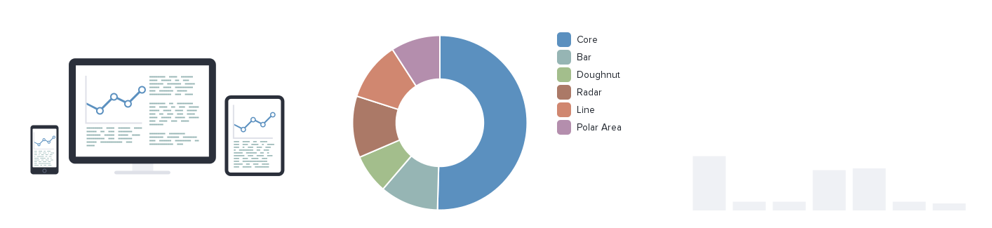
As you can imagine, to present this information nicely we needed a chart library! So my first task was to evaluate various chart libraries and decide which would fit the best for our purpose. Finally we decided to use Chart.js because of it’s simplicity but also powerfulness.
Gathering the relevant data and presenting it
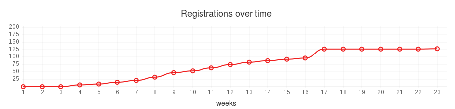
How many people are going to show up?
The most important piece of information to show was the progress of the registrations over time. We decided that a week is enough granularity. To get this data I implemented a method in the conference model.
def get_registrations_per_week
  result = []
  reg = registrations.group(:week).count
  result = calculate_items_per_week(21, 6, reg)
  result
end
We query the database for all registrations, group them by week and then count them. As you can see :week is a database column, this was nessecary to make this query database independent. We then go on to cumulate the registrations for each week, with padding on the left side (in case you haven’t registrations in the first weeks).
def calculate_items_per_week(start_week, weeks, hash)
  # Insert zero if key not in hash
  (start_week..(start_week + weeks)).each do |key|
    if !hash[key]
      hash[key] = 0
    end
  end
  result = hash.sort.to_h
  result = hash.values

  # Cumulate the values
  sum = 0
  result.map { |x| sum += x }
end
So in the end if I have four registrations in week 23, six registrations in week 25 and two registrations in week 26 and my registration period started in week 21 the result would be:
[0, 0, 4, 4, 10, 13]
That’s a nice dataset to show in a line graph!
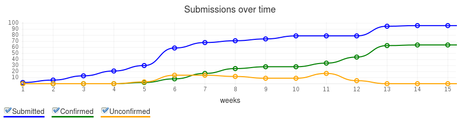
What are people submitting to my call for papers?
For the call for paper submissions we not only wanted to show the progress but we wanted to show the progress of the different states (e.g. submitted, accepted, confirmed). As it turned out, this was not so easy as initially thought! The reason is that, as you can imagine, the event states change so that we can’t just do a simple database query at rendering time. Instead we have to take a snapshot each week of the event state distribution and save it to our database (like ‘historical data’). Luckily we use the papertrail gem to track the object changes. Therefore I was able to calculate the event state distribution of past conferences, too. :) To get the amount of proposals in a certain state I implemented the following method..
def get_submissions_data
  result = {}
  result = get_events_per_week_by_state

  start_week = call_for_papers.start_week
  end_week = end_date.strftime('%W').to_i
  weeks = weeks(start_week, end_week)

  result.each do |state, values|
    if state == 'Submitted'
      result['Submitted'] = pad_array_left_cumulative(start_week, values)
    else
      result[state] = pad_array_left_not_cumulative(start_week, values)
    end
  end
  result['Weeks'] =  weeks > 0 ? (1..weeks).to_a : 0
  result
end
At first I fetch a hash with the submissions per week for each state. Therefore I implemented the helper method
get_events_per_week_by_state
which selects the values from the database and returns a result that looks something like this:
{ 'Submitted' => {22 => 1, 24 => 2}, 'Confirmed' => {23 => 1, 25 => 2}, 'Unconfirmed' => {22 => 1, 24 => 2} }
We only keep in account proposals that are submitted between the call for papers start and the end of the conference! The next step is similar to the registrations over time with one difference: We just want to cumulate the values for submitted proposals and not for the other states. Let me explain that a little bit more. To get the submitted proposals we can do a simple database query (it’s very similiar to registrations over time) but for the other states we have to take a snapshot at the end of each week! Because of that it’s not necessary to cumulate the values! Last but not least I add the weeks (the x-axis) to the result hash. The result for the example above would then simple looks like this:
{ 'Submitted' => [0, 1, 1, 3, 3], 'Confirmed' => [0, 0. 1, 0, 2], 'Unconfirmed' => [0, 1, 0, 2, 0], 'Weeks' => [1, 2, 3, 4, 5] }
How is my program going to look?
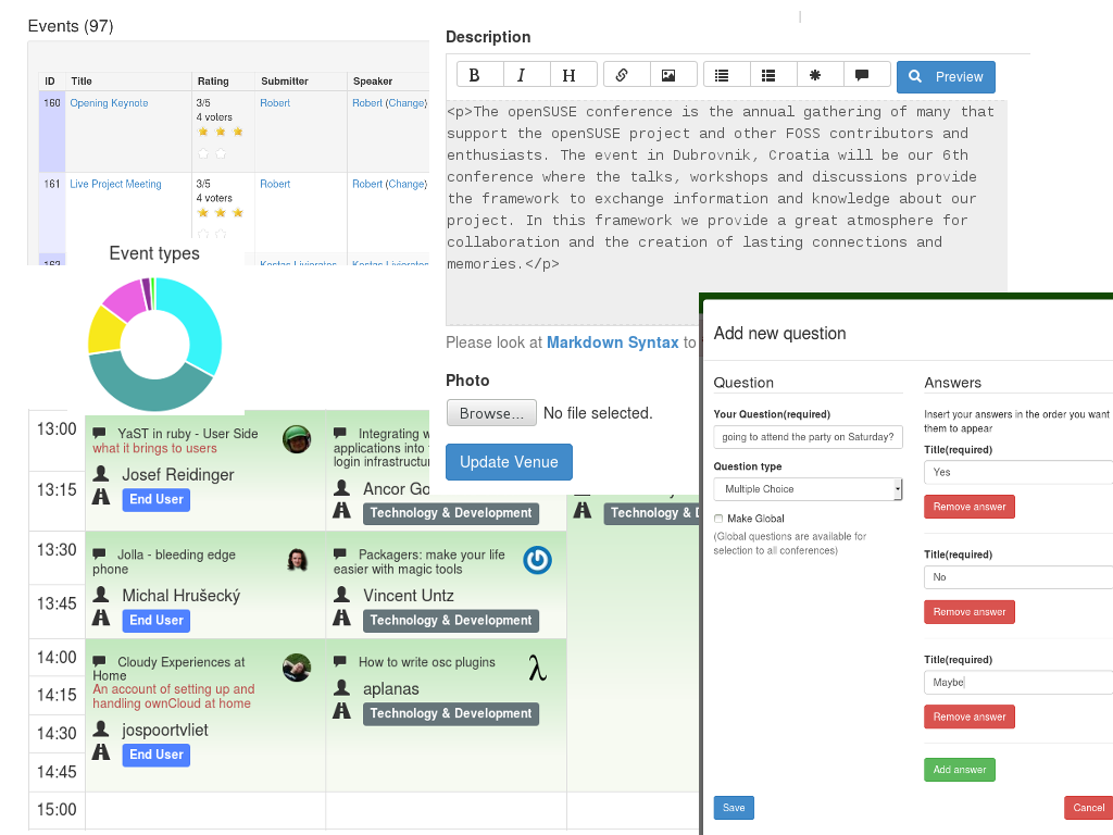
Another really essential information for conference organinzers is how the program is going to look. This includes for example how many events do I have for a certain track (e.g. end user, business), difficulty level or a special type (e.g. short talk, workshop). These information is crucial for the organizers because so they can see if they have to less or to many events for a track. Luckily Chart.js doesn’t only support line charts, it also supports pie charts which is the preferred display mode for these information. The following image shows how this feature does look:
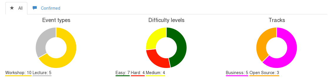
To get the track distribution I implemented for example the following method:
def tracks_distribution(state = nil)
  if state
    tracks_grouped = events.where('state = ?', state).group(:track_id)
  else
    tracks_grouped = events.group(:track_id)
  end
  calculate_track_distribution_hash(tracks_grouped, tracks_counted)
end
As you can see in the image above, we have two different tabs for this feature. The first tab shows the conference programm for all submitted proposal no matter in which state they are (e.g. submitted or rejected) and the second tab shows how the program would look only for the confirmed proposals! To meet this requirement, our function is generic: If you just call
tracks_distribution
you will get the information for all proposals and if you call
tracks_distribution(:confirmed)
(or any other state) you will get the information just for this state.
def calculate_track_distribution_hash(tracks_grouped, tracks_counter)
  result = {}
  tracks_grouped.each do |event|
    if event.track
      result[event.track.name] = {
        'value' => tracks_counter[event.track_id],
        'color' => event.track.color
      }
    end
  end
 result
end
The function
calculate_track_distribution_hash
then simply assigns each track the amount of proposals and the associated hex color. The result would simple look like this:
{ 'Workshop' => { 'value' => 10, 'color' => '#00FF00'}
Show, don’t tell
In the end, if you plug all of this together, we ended up with a nice dashboard for conference organizers.

What’s left for the remaining GSoC time?
Because of the new features that my GSoC colleagues and I implemented over the past weeks the admin interface has become very complex and confusing. As you can imagine, that’s very bad because an interface should be simple, easy and comprehensible. Otherwise the organizers won’t use our awesome new features. Reconsider and refactor the admin interface and menu will be my task for the remaining few weeks.
I hope you enjoyed this article, I’m looking forward to your comments below. And don’t forget to check out my other posts in this series